2020 has given us many lessons. Design-wise, many of our home spaces have desperately need a new paint job. Being stuck at home often has probably highlighted this to many people. Many clients have remarked that they look critically at our houses’ interior these days. Many of of those who have been at homes more than it was expected, have been looking to freshen things up. If you have been thinking hat the interior colours of your home appears a bit dull after looking day after day then this could be an inspiring post for you.
Don’t stress – a simple internal painting job can be an easy solution to cure the drab feelings you might have. Or even brighten up that home office for your Zoom meetings. Our professional painters can always help.
It can be a fairly straightforward task to redecorate your walls, but it has the ability to totally change your room’s feel and look dramatically. One of the key issues is which shade of colour should you choose? We have been reading many design magazines and research online to keep up with trends. ultimately it is our clients decision, but we also enjoy using colour of course.
The below colour shades are some many designers feel will be popular in the next year in order to help you launch 2021 on a brighter note. Although their choices range from elegant natural colors to earthy shades, to audience blues, one thing is for sure, building calming spaces will probably be popular in the upcoming year.
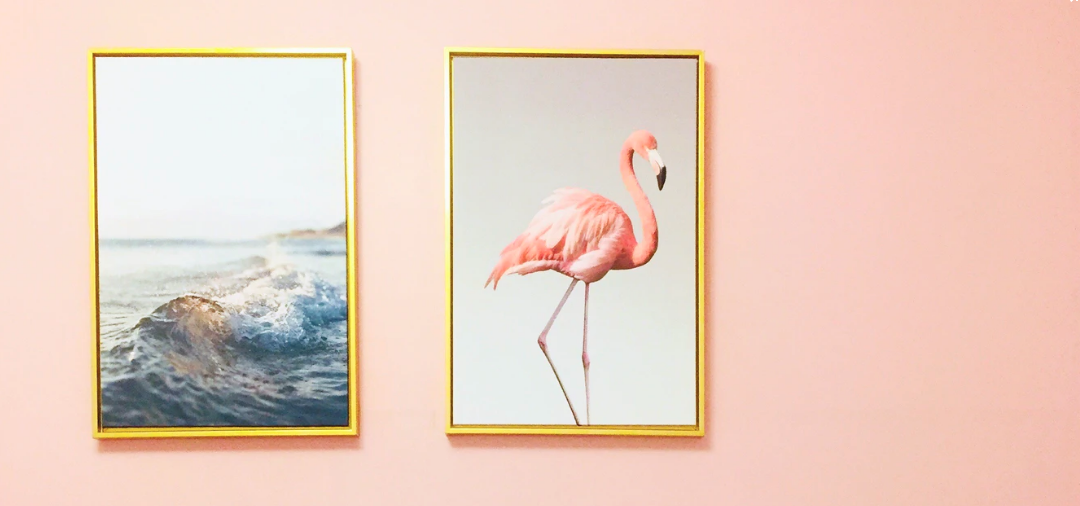
In Blues
Blue has been renowned for being an amazingly calming color for about as long since we can recall. (Don’t trust us? Think of how comfortable people get whenever they gaze at the sky or lounge by the ocean.) For so many, 2020 has become a challenging year, so it was only normal for blues to be an ‘it’ shade.
Nature
Most of us are missing some quality family time with the countryside since we have had a lot of time stuck indoors. Trying to incorporate earthy colors to your home will also be a popular choice to help us feel less “inside” all the time.
“While our house begins to be a refuge in 2021, we’re seeing such a rising awareness in accentuating the space with such a soothing earthy colors theme,” says Christina Holland, CMO of Interior Define. Customers bring the outdoors in and gravitate to the vivid hues seen in nature, like vivid citrines, soft greens and blues, chocolate browns, and burnt rusts. Through wall paint, furniture items, or decorative items, mixing these earthy shades produces energy and brings relaxation to the room.
Brown
Though earthy shades are set to strike it rich in 2021, Kiel Wullner claims that perhaps the only hue that might dominate it all will be brown.
For as long as a decade, grays have been quite popular, also as a contrasting colour choice. Yet the interest for hotter tones is making a rebound, says Vesta’s, VP of Plan. Delicate tans and beige tones are being utilized for divider tones and upholstery, like in our Vesta Collections Monet Lounge Chair to bring a delicate, homier sparkle to spaces.
Wulllner’s right: a drop of brown seems to be the fresh breath of air our rooms deserve, after decades of the same black and white paint scheme. Brown is a great way to break up areas of your home into unique “sections” or “zones”.
Aubergine
Need to get yourself some self indulgent extravagance? As indicated by inside architect Jean Liu, 2021 will be about rich, bold, grouchy tones. That is aubergine.
“Aubergine everything,” she says. “We’re pulverizing hard on this shading now, and we think it sneaks up all of a sudden for setting the temperament of any room. It additionally peruses like a nonpartisan to us, making it a simple paint tone to work inside an assortment of homes and settings. Our go-to shading for this is right now Farrow and Ball’s Brinjal.”
We can picture this tint being a ravishing scenery for some detailed prints, extravagant surfaces, and overlaid equipment.
Get Ready Saffron
Because your itinerary items have been required to be postponed doesn’t mean you can’t flex your joyrider status. On the off chance that you will require to carry a cut of hunger for new experiences to your home, planner Shawna Underwood suggests adding intense shades like saffron.
The majestic shade of saffron is a sudden fly of shading that can be combined with nearly anything, she says. In 2021, I accept we will see surly charcoals, immersed reds, or invigorating turquoise play as backgrounds or accents to the complex tint of saffron. Getting comfortable on a rich velvet couch or painting a whole room in saffron will immediately make you feel like you are living abroad.
This tone resembles a moment excursion—no identification required.
Hello, Yellow
Why stop at saffron? Creator Isabel Ladd says yellow, all things considered, will sparkle splendidly in 2021.
Yellow used to get unfavorable criticism for being excessively conventional or excessively dull, she shares. At the point when I ask new customers what shadings they’d like me to evade, they definitely say, ‘Yellow.’ But that is on the grounds that you are not utilizing the correct shade of yellow, and it can be sure look frump and deadened. A certain, strong, and fresh yellow can truly make this tone (and the room!) emanate. What’s more, don’t consign this to paint. The backdrop is a magnificent method to get a striking tone and example, [which is] consistently a triumphant blend.
Neutral
As indicated by Highlyann Krasnow, organizer and imaginative overseer of a store configuration firm called The Design High, you can never turn out badly with neutrals.
Whites and light neutrals are the new tones, or even better, non-shade of decision, she clarifies. We’re foreseeing the layering of various adaptations of whites with dark accents will be the advanced, basic pattern tasteful.
The best thing about unbiased paint? You can consistently develop your place, adding striking examples and flies of shading as you see fit.
Pastel Palette
Need to transform your home into a mitigating safe-haven? You’ll need to go to the delicate side.
“I believe that individuals will decide on more peaceful—yet still upbeat and elevating—insides during a tumultuous time, both regarding shading and example,” says fashioner Elizabeth Cooper. “[Hues] like clam, chalk, cream, cereal, delicate sky blues, and celadon greens will be go to’s for a more peaceful 2021.”
Need to cause your quiet space to feel considerably more comfortable? Blend and match material textures in a similarly repressed tint. They’ll fly against your pastel paint without upstaging the remainder of the space.
If you want to work with a house painter in Melbourne that is happy to use whichever colours you like, then contact us for a free quote. We can still give advice, but it is your home after all.